
Sunday, 26 December 2010
The Duck and the Woolly Beast
Saturday, 25 December 2010
Illustration Friday: Winter

This week's topic is "winter". Here in Denmark we have minus 10 degrees Celsius and 30 cm snow, but that is highly unusual, so snow doesn't really represent winter for me. Instead I think of the pale blue winter sky on cold days and dark naked trees. For some years I worked in a building next to a field with a row of trees surrounding it. Late in the afternoon on winter days, after the sun had disappeared, a large group of crows would gather in the threes. Sometimes there could be a couple of hundreds. At some point, they would suddenly all take off in a large flock. I remember vividly the sinister feeling when walking home through the dusk, I would suddenly see them rise over the city and hear their screams.
Thursday, 18 November 2010
More lifedrawing - now with pastels

Sharon showed me how to work with pastels in the spring. I did buy a pack of soft pastels from Winsor & Newton and a pad of pastel paper, but I have not really given it a try before yesterday. Then yesterday morning, I couldn't find my pencils and instead grabbed the soft pastels and a pack of pastel pencils before I ran out of the door. At the class, I just had to get on with it. It is not perfect, but for a second try (see first try here) I think it worked out really well! I am definitely going to work pastels again next week.
Saturday, 23 October 2010
15. Join a life drawing class

P.S. I have been wanting to upload this for 1½ week. I have tried to scan this at work, but it is difficult to scan as it is drawn on really large paper (larger than A2), so you will have to put up with this poor quality photo. I will try to make a better scan next week.
Tuesday, 5 October 2010
Chase

More drawings here: http://www.flickr.com/photos/35208838@N05/tags/movement/
Wednesday, 29 September 2010
Cherry tree

Monday, 20 September 2010
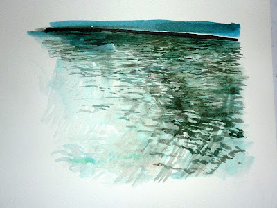
New weekly challenges: Draw water surfaces
I feel I need some input in order to do a weekly drawing. I should like to try to make a set of illustrations for a story, but I don't have the time right now. Instead, I have thought of reviving the weekly challenge. At the end of the Exploring Illustration course, Ann gave us a list of exercises. I have added a page with the list, see link in the top left corner. Some of exercises are pretty weird, so I don't think I will do them all or do them in order. Instead I will just do the ones that inspire me, or fit with whatever I am doing that week.
This weekend I looked at the first exercise: Draw water surface: reflection, depths, and movement. I live very near the river, so I went down there and studied reflection and movement without drawing. Then I tried to make some drawings on the spot, but I also took some pictures and made the drawings from the pictures. I tried to paint small and larger waves at the same time, to show movement. There are a couple more water drawings on flickr.

This weekend I looked at the first exercise: Draw water surface: reflection, depths, and movement. I live very near the river, so I went down there and studied reflection and movement without drawing. Then I tried to make some drawings on the spot, but I also took some pictures and made the drawings from the pictures. I tried to paint small and larger waves at the same time, to show movement. There are a couple more water drawings on flickr.


Saturday, 18 September 2010
Observing the observer

Some months ago, I got into a habit of taking a couple of scienticfic papers and go to a nice little cafe here in Oxford on Sundays. It almost don't feel like work when you sit with cappucino on a cafe and it allowed me to read up on topics that were only borderline work-related. However, there was this middle-aged man who would almost always sit and draw people at the café. He only drew young women and only their faces. He didn't try to hide that he was drawing, in fact, when he had finished the drawing and he would come up to girl he had been drawing and show her the drawing. I didn't particularly fancy been drawn while I was reading, so I usually sat myself with my back against him. Then one day he came later than me, sat down at the table in front of me and began drawing. He sat there staring fixedly at me while drawing; it was extremely uncomfortable. I tried to hide behind my hair and otherwise express my discomfort. He nevertheless continued, for perhaps 20 minutes and then came over to me to show the drawing. It was a cartoony colourpencil drawing and not very good. I didn't know what to say.

 I must admit that I have stopped coming at this particular café. On the other hand I also like to draw people in public places (like these old drawings on flickr). What do you think? Is it okay to draw people in public places? Should you ask permission? Or is it okay, as long as you do it discretely?
Sunday, 12 September 2010
Chomerac - Assignment: Mixed Media

 This is the final assignment with a small selection of my plans for the piece above it. I wanted the building to be the focus so have concentrated most of the detail and colour there. The open red doors, v.p. and mountaintop are on three of the four points of the Golden Mean (the image is slightly zoomed so that may not be immediately obvious).
I've used drawing inks, Derwent Coloursoft, Caran d'Ache Neocolour II, Onyx Medium and Dark and pen, amongst other media.
Chomerac - Preliminary Sketches 2


The pencil images above have been worked up underneath in Pentel G-Tec C4 gel pen, various W&N drawing inks, Neocolour II wax pastels and Derwent 'Onyx Dark'. I couldn't bear to tear pages out of my Moleskine books so have photocopied the pages - I wait to see if that's 'allowed'!
Chomerac - Preliminary Sketches 1

 Apologies for the shoddy photography - I had to photograph both sketchbooks really quickly before posting (just to have a record of what I'd posted); when they are back, I'll photograph them properly. I've finished this particular course now and the two assignments have been posted to my tutor. (I worked on both whilst in France in August.) I really, really miss the course!
Again, we had to focus on landscape and mixed media so I have tried to use a different medium on each page.
Sunday, 5 September 2010
The rabbit story
Sharon asked in a comment, what I did with the clay rabbit, so here is a little 6-page picture book story using the clay rabbit. We also made another 6-page story in pairs where we used the two clay rabbits together. I think having an actual model was useful for character development.


Storyboards

Monday, 30 August 2010
Alternative techniques: white on black
Here is some more stuff from the Children's book illustration course. The teacher April spent some time introducing us to alternative techniques. Her rationale was that children's book illustration is highly competitive (like any field of illustration), so it was an advantage to have a wide range of techniques, so we spent a module on techniques that works white on black.
Among other things we tried scraper board techniques.

I like the look, but this was a tedious technique and quickly made my neck ache. More fun, though also slightly more dangerous, was chlorid-based bleach on ink:

It is the kind of bleach you would use to clean your toilet or similar. First we painted a sheet of paper with ink, and then added the bleach. Because the ink is based on blue and orange, the bleached spots look somewhat yellowish or orange, according to how much ink and how much bleach was used. It looks quite nice, like lights in the night. However, the stuff is poisonous and a bit tricky to work with, so I don't think it is a method I will use again.
The thing about both of these techniques is that, well, you could probably do this much easier on computer. You probably wouldn't get exactly the same effect, but something that was similar enough, to make the effort in doing it by hand worthless. It is very difficult to get the "light in the night" effect with water colour, but you could probably make an ordinary watercolour drawing, scan it and subtly create the lights. As for the scraping board, see this beautiful webcomic, Digger, which is computer drawn. It doesn't look like scraper board, on the contrary, it has more layers than you could make with a scraper board. When I made the bird above, I realised I began to mimic the effects from digger in the chest area, but it was difficult to get the same multi-scratch effect without ripping the paper beneath.
Saturday, 28 August 2010
Chomerac - Assignment


The colour drawing is the final drawing for this assignment. (Only one more before the end of this particular course.) It incorporates everything from the exercises I had to do, eg. landscapes, buildings, trees, statues, gates, a view through something, perspective (angular, linear and aerial), straight lined objects, natural forms and composition. We were instructed to add, delete or move objects to form a better composition and I deleted all the chimneys and pipes. The horizon view has been changed by bringing the mountains and fields 90 degrees to the left. (In reality, straight ahead, there is a lowered garden behind thick trees.) I moved the chateau 45 degrees to expose the facade with its orange shutters. I replaced a pool table with two pot plants from the R.H. garden and brought the foreground red flowers and lovely statue/fountain from behind to the front of the archway.
The jazz summer school students would recognise all the elements of the drawing but would know it is radically different to the real scene.
Tuesday, 24 August 2010
Chomerac - Water Bearer

Just back from Jazz Summer School in France. This is another favourite statue from the grounds of the Chateau Bijou where it is held each year. (I drew and smudged the image all over with a Derwent Onyx Medium then picked out the highlights with an eraser.)
Tuesday, 17 August 2010
Children's book illustration course on CSM
I am going to post some stuff from the children's book illustration course I was on last week.
We made these little rabbit figures in plasticine to draw from.

We drew them from different angles and used them to model postures for a simple story line.

I found this exercise really interesting. After writing the post about Jill Bosserts Children's illustration book, I ordered her two other books from amazon (they cost me about £5 each). They are very much recommended; like the one on children's books they show both the research and idea generation and the actual illustration technique. One things I wondered about was that a couple of the illustrators took the trouble to make little models to draw from. I thought that that was an awful lot of trouble to take, but now, after having seen how much you can get from modelling, it doesn't seem so unreasonable. I think it is especially an advantage if you are doing a lot of pictures of the same character from different angles.
Just a llittle more about the course. The teacher on the course is April Wilson who has run the same course for many years. The course is very different from the Exploring Illustration course. No coffee breaks for one thing, and a very tight schedule. Each day is divided into two modules, morning and afternoon, and in each module we looked at a technique and tried to apply it in a simple assignment. I think, it is better to take this course as a 10 weeks course where you have a module a week so you will have time to finish the assignment. It was kind of frustrating never really to get finished before we had to move on.
I will post some more from the course the next couple of days.
Saturday, 7 August 2010
Familiar/Unfamiliar?

Seeing this again on the news recently, it struck me that it is an instantly recognisable image but one would be hard pressed to describe it in detail so I decided to sketch it. (I didn't spend a long time on it, as you can see! It is 4"x4".)
Tuesday, 3 August 2010
A good book...
Sorry about not posting. I must admit, my drawing drive has completely left me. I try to draw, but my heart is not really in it and I can't get my drawings to work. Luckily, I am going on a children's book illustration course next week and I am sure that it will restore my drawing mojo.

So instead of posting a drawing, I thought that I would write about a really great book that I found at the library and found very inspiring. It is "Children's book illustration" by Jill Bossert. It is out of print, but can perhaps be found at the library. It is one of the best books on illustration I have seen, and actually also one of the best step by step guides. The author has interviewed nine very different children's book artists. They each describe a project they are working on, how they got the assignment and how they work together with the editor and the writer. The book then shows in detail how each artist creates an illustration for the book. The artists describe their research and how they approach the text. The amount of research that some of these artists do is really impressive. The artists also describe their illustration techniques and the tools and materials they prefer to work with.
The book is out of print and appears to be pretty difficult (and expensive) to get a copy of, so hopefully there is no harm in posting a couple of pictures from the book.


The book is one is one in a series of three; the other two are on advertising illustration and editorial illustration. If they are anything like the one on children's book illustration, they are worth looking for.
Friday, 23 July 2010
Sketches of an individual tree

More coursework - hot off the press! We had to draw four versions of an individual tree: a simple outline, foliage forms, outlines of the trunk and 'scribbled outlines' to indicate texture and foliage. I have been working from sketches and photographs from Cumbria a few weeks ago, done specifically with my coursework in mind. (Drawing ink and bamboo pen on cartridge paper.)

Wednesday, 21 July 2010
Gorillas

Friday, 16 July 2010
End of the Walk

 I have just completed these two images for my coursework. The exercise is to do a 'limited palette study' of one of our recently drawn perspective sketches. The scene is the end of a three mile walk we do regularly at Marston Locks and reservoirs, near Tring. If you follow the 'yellow route' clockwise from the car park, you end up overlooking the trees and pub. If it's late, it is all lit up which is nice.
I chose to use the traditional colours: brown, sanguine, black and white.
The original sketch is 10" square, whereas the coloured drawing is a 21" square and the vanishing points are quite a way to the left and right of the picture frames.
Tuesday, 13 July 2010
Technical drawing

Saturday, 10 July 2010
The Prize


This refers to a verse in the Bible that ends "... a crown that will not fade." It refers to the transient and materialistic things that we pursue in our life that we cannot take with us but, instead, we should aim for a prize that will last forever.
I've included the initial sketch as it shows my initial plans for the shapes and also my pencil attempts at making the jewels sparkle. Need to outline the velvet thinly in white so it is visible.
Other artists in our team have painted trophies, plates, etc., but I have only included my own artwork here.
The Price
 This represents 'the price' (or cost) involved. The athlete rises early, eats well and endures a punishing routine...
The Preparation: Old and New
 As I've had absolutely no time to any additional artwork these past two weeks, Gry has suggested I show what has been pre-occupying me.
On the LHS is (a very young) Bobby Charlton with the old 1966 brown leather football and the old 4-4-2 formation chalkboard training plan. On the RHS is Stephen Gerrard in front of the newer 'diamond formation' on the now used whiteboard. Above them on the right is the skittish Jabulani football. I've had to 'fudge' the sponsors' names in every case for the sake of copyright.
Monday, 5 July 2010
View from south park

Tuesday, 29 June 2010
Ocean: Oh Dear!

I know it's not really an ocean but I wanted to draw this image as it is amazing how in just a couple of months our perception of sea life can so radically change. I ran out of time again...
Monday, 28 June 2010
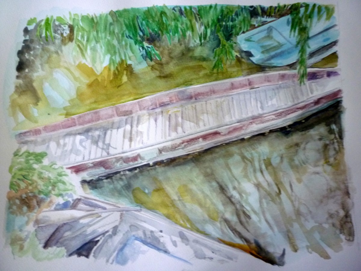
Old punts on the river
Sunday, 27 June 2010
The last challenge
That was actually the last of the 12 challenges. Sharon and I have been talking about that we should like to continue the blog in order to keep drawing a bit every week. However, it will be in a new form; instead of having a challenge, it just have to be a fresh drawing that we have made that week. It should still be uploaded by Monday evening. Or rather, from now on, the drawing should be uploaded by Monday evening :-)
Wednesday, 16 June 2010
Monday, 14 June 2010
Imaginary bird

Saturday, 12 June 2010
Film still: Discovering a murder on the Orient Express

A picture from the 1974 adaption of Murder on the Orient Express. Films are a great source of motives, both in terms of scenery and facial expressions, but in particular of interaction between people. While I can draw a single expressive figure, I often find that quite difficult to draw to or more people interacting. They often end up not quite looking each other in the face or somehow not being together though there are on the same page. Also, when you have use a film as reference instead of a picture, you feel the mood and the tension between the characters better and I think it shows.
An extension of this exercise could be to take an entire scene and convert it to a comic book page of 4-6 picture.
Darkness over London

Inspired by Sharon, I also drew a cloud study from a picture of looming grey clouds over the river. I took the picture in London last summer because the scene reminded me of the opening of Heart of Darkness, so I thought it was a fitting motive. I haven't quite caught the looming feeling though, probably because there is still too much white on the paper - I really need to become better to work with colours.
Monday, 7 June 2010


Tuesday, 1 June 2010
10 - Reflection
Draw your own reflection in something - a side mirror, a spoon, a doorknob, a window...
Monday, 24 May 2010
Darkness approaching

This is a small cloud study I did last week in soft pastel on Pastelmat paper and I realised it could be used for our 'darkness' challenge.
Subscribe to:
Posts (Atom)